- ArticlesDesign
They quoted us £75,000, so we did it ourselves: the Cuckoo brand story
After being told by top London agencies it would cost upwards of £75,000 to develop our brand; we decided to embrace the challenge and keep it in-house.
It’s 3 months since we published our brand story. Since then, we’ve been busy launching the website, switched over our first customers, built the billing engine and gave one lucky person free broadband for a year.
This is a case study of how we made joining Cuckoo simple.
A reminder of what we stand for and why we’re all here.
Broadband is broken. Terrible service, complex deals, sky-rocketing prices — it’s a long list. And to top it all off, we’re forced to haggle for a new deal every year or risk paying extra. Which is why we’re doing it differently. And finally putting customers first. Not just by giving them amazing service, but by making broadband simple. With one great speed, at one low price, on a one-month rolling contract. So customers never have to switch again, because they’ll always be on the best deal. Even better, 1% of each bill helps us spread the awesome power of the internet to where it’s needed most, like conflict zones, natural disaster sites and developing communities.
We’re called Cuckoo.
And we’re making broadband simple. For good.

Traditionally, you’d have very little engagement with utility providers — unless something goes wrong. This is changing. People expect more.
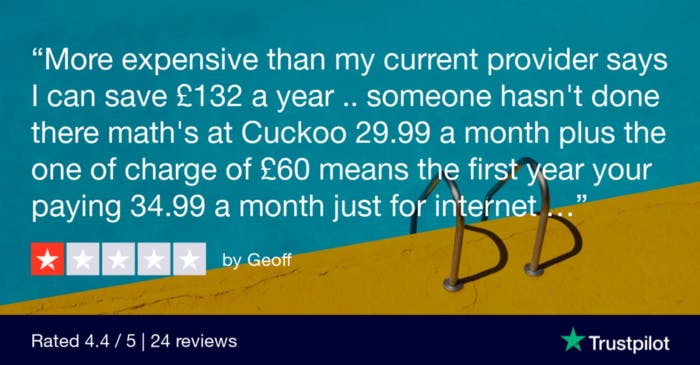
For example, we received a 1-star review because someone felt our copy was misleading. So although we were confident that what we said was correct, we took the feedback on board. How could we be even more transparent; even more distinctive versus our competitors? Within 30 minutes, we’d updated the messaging on our site.
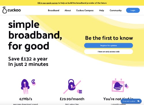
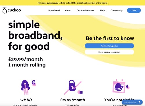
On average a customer switches provider every 6 years ( Ofcom ). People’s motives for switching vary. When we asked customers, 39% said they were disappointed being tied into a long contract, 38% said their prices were increased, 30% said poor customer service and 17% had no affection for the brand.
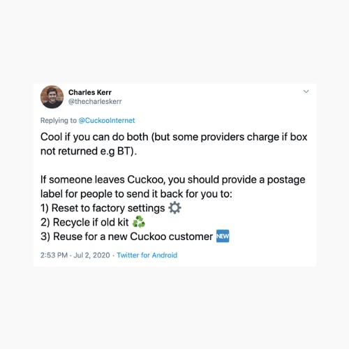
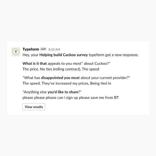
Long contracts. Hidden price rises. Terrible customer service. Things you won’t find at Cuckoo. Throughout all our customer touchpoints we aim to understand behaviours, triggers, pain points, and motivations. As you read on, you’ll see these insights influence all the design decisions.
C uckoo’s brand promise — centred around the idea of making broadband simple, for good — is the backbone of the brand, including the customer experience. For us, brand and UX are two sides of the same coin.
We created Cuckoo because we knew we could do broadband better. Our experience principles set out to do just that, so users feel chuffed to be part of our flock, every time they engage with us.

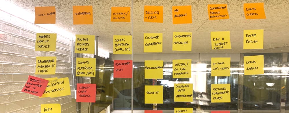
It takes twice as many clicks to switch broadband with the big guys than it does with Cuckoo. We audited all the key info we needed to capture from customers in order to switch them, then broke them down into a few simple steps. When it comes to online transactions, forms are king . Applying usability best practice, reducing any friction points, providing clear signposting and removing any distractions makes completing their goal of switching easier.
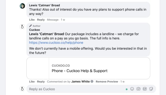
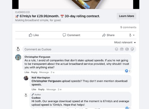
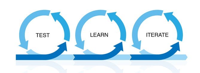
We’ve iterated on our product messaging on the homepage 25–30 times over the last 90 days. That’s roughly every 3 days. From looking at the analytics to listening to what people say to us, we use a ‘Test’, ‘Learn’ and ‘Iterate’ model to improve our service.
In June we launched our first paid social ads across Instagram & Facebook — giving us direct access to customers and hearing what they have to say. And they have a lot to say . Most of our recent new features or front-end optimisations have been inspired (or suggested) by people on our community or via social media. In the words of Bear Grylls; Improvise. Adapt. Overcome .
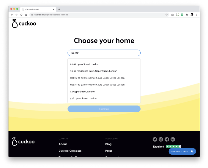
At all times, we aim to reduce the cognitive load of customers. By giving them clear signposting and only providing relevant content. Customers should have no doubt what their next action is in order to progress to signup.
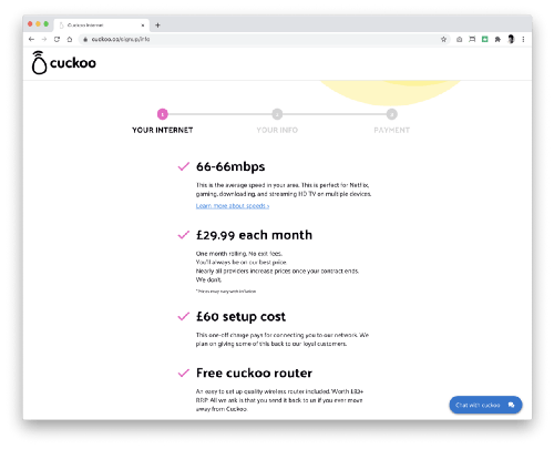
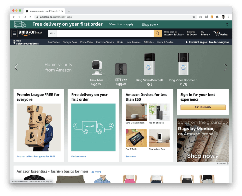
At this point we remove any distractions so the user can focus their attention on switching; any additional content is removed and the global nav bar is no longer displayed. It’s like the opposite of Amazon; rather than wanting you to add more things to the shopping basket, we just want to get you through the funnel as frictionless as possible.
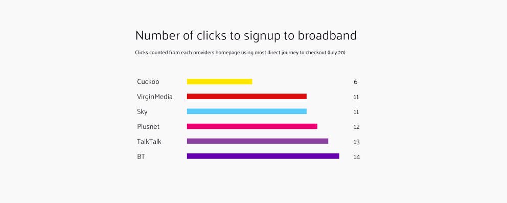
Switching provider is daunting. This is only made more intimidating with long, complex forms. Our competitors are presenting customers with up to 7-step forms in order to switch to them. Our primary aim was to reduce this number to 3 simple steps, whilst still capturing all the essential information we need to switch someone.

When a customer enters their address, we give them a specific estimate of the speed they would be getting with us (rather than the average of our customer base).

We’re transparent about our speeds and our prices . We go one step further and humanise what that speed actually means to them; for example, 60Mb/s is perfect for Netflix, gaming, downloading, and streaming HD TV on multiple devices. We avoid ambiguity at all times.
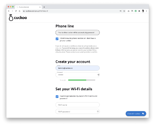
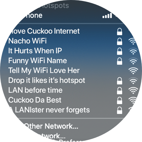
With Cuckoo, you can set your Wi-Fi name and password when you sign-up. Say goodbye to random, forgettable codes. Creativity encouraged. Do you know of another provider that does this? — none we know of yet.
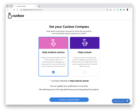
We take 1% of each bill and use it to help get the internet to places it’s needed most, like conflict zones, natural disaster sites and developing communities. And then we ask during the signup, which project you would like to support. Do good, simply by being on our network.
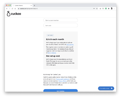
At key decision points in the journey, we recap what the customer is signing up for, so there are no surprises later on. We ask for as little input as possible to ensure a somewhat mundane task feels effortless to complete. We do as much of the heavy-lifting as possible so our customers are left with a feather-light load. But we also make sure nothing sounds too scary or challenging.
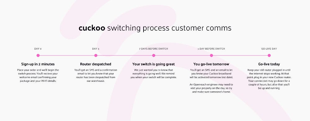
It takes roughly 10–14 days to switch someone over to our network. We’d love to speed this up but it’s defined by Openreach and Ofcom. We looked at all the moments during that period and defined when people would need the most reassurance that their switch is going well and to give them timely information to assist their onboarding.
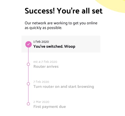
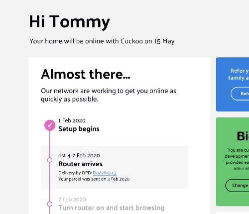
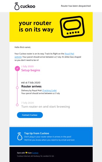
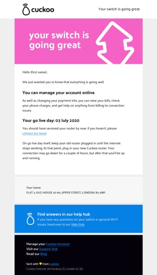
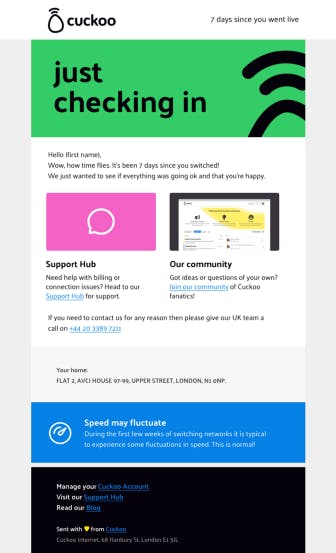
Once a customer has signed up they gain access to their Cuckoo account. (I will write about My Account in a future update.) This is where the self-help tools we’re building will live, where you will be able to view your referral info and of course update all your personal information (you can do that already, actually).
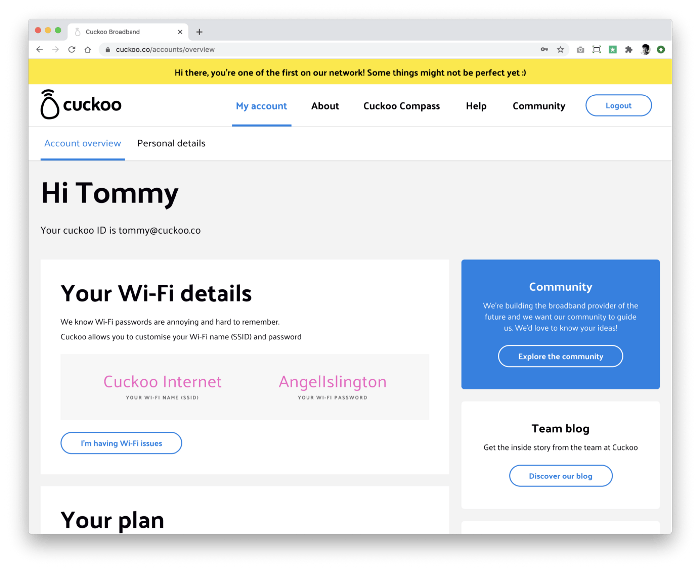
We use the bright yellow Cuckoo message bar to deliver key messages to people. At the moment, it’s letting users know they’re one of the first on our network and that some things aren’t perfect yet. At least we’re honest :) If you’d like to be one of the first too, then head to our site and sign up.
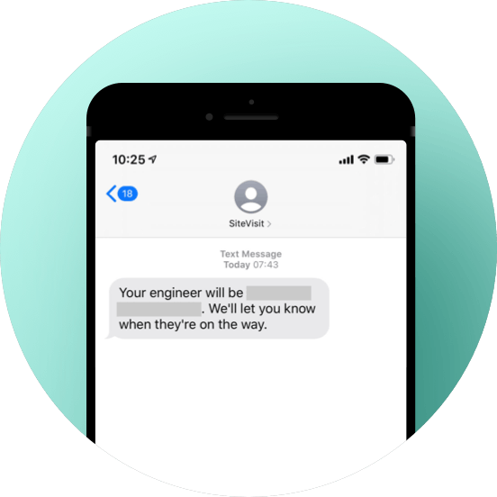
You don’t have many physical interactions with your broadband provider. Perhaps the odd engineer visit when you switch provider. If an Openreach engineer is needed they’ll send you a text to let you know.
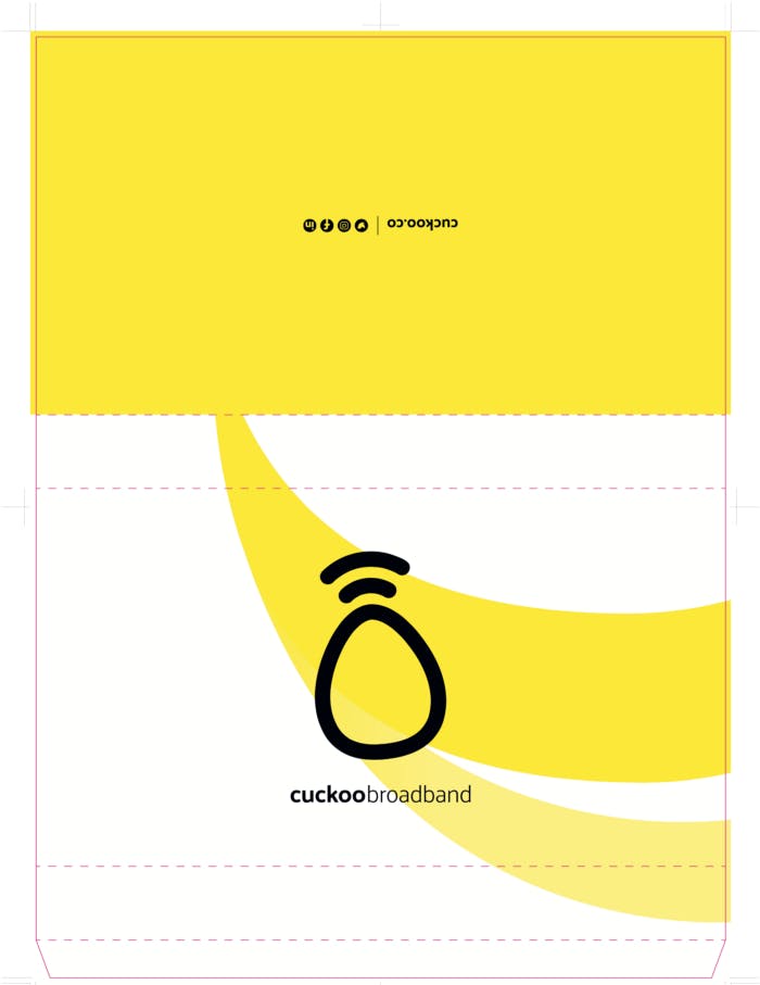
So the one moment, when you first receive the router — we wanted to make it exciting. Here’s a sneak peek at the top-secret new packaging design. Shh, don’t tell anyone .
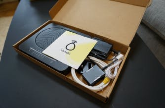
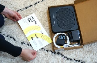
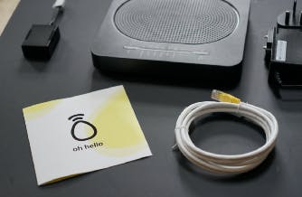
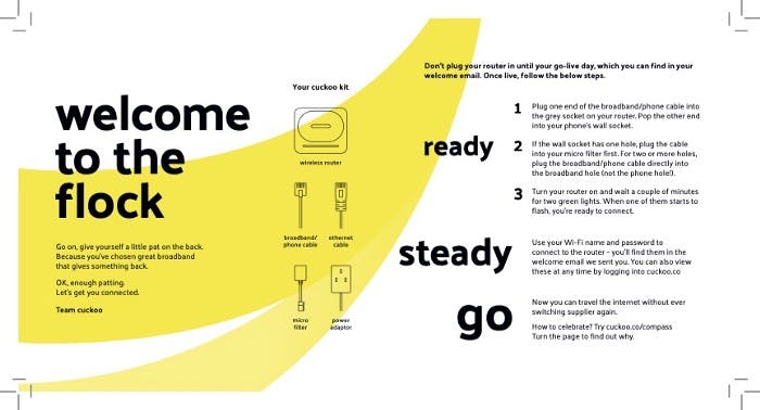
We did an audit of some of the competitors box-opening-experiences. To be fair, some of them have clearly invested in slick packaging (hoping one day Alex will let me splash some serious Cuckoo dollar on shiny boxes that explode with glitter on opening…) but the reality was, the setup instructions were still incredibly difficult to decipher. Not-so-quick-start guides, confusing messaging and baffling acronyms. We decided to create a 3-step guide that’s just as straight forward as our box. Simple.
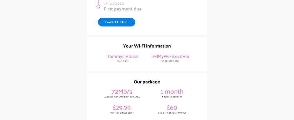
Once you’ve plugged in your router and the light goes green, you’re all set to go. Now you just need to enter the Wi-Fi details you gave us at signup and voila.
If you’ve forgotten your details, simply check your welcome email or just login to cuckoo.co anytime.
Next up for you: We’ve now removed our early access list and opened the doors to all. So what are you waiting for? Switch broadband, for good.

After being told by top London agencies it would cost upwards of £75,000 to develop our brand; we decided to embrace the challenge and keep it in-house.