- ArticlesService
How to disrupt a £12bn industry; the Cuckoo pricing story
We’re making broadband simple, for good.
This is the story of Cuckoo and the creation of our brand. Nice to meet you.
Broadband is broken. Complex deals. High prices. Bad service.
The broadband ‘loyalty tax’ now stands at £1.8 billion every year. But it doesn’t have to be this way. Simple deals can work. Cheaper offers are possible. Smoother service is needed.
So here we are. Cuckoo offers transparent pricing and outstanding service. One simple deal. A rolling contract. And easy to deal with. The internet is magical. We’ll return it to what it was meant to be.
![Cuckoo Starting Team [Mar 2020] Alex had to borrow one of my shirts #cantbuystyle](https://images.prismic.io/cuckoo-egg/f8f87112-eb97-457e-bc0a-7957a7292dcd_team-full-bleed.jpg?auto=compress,format)
From the Burger King car park where Alex and I first chatted about Cuckoo, through to the evolution you see today. This is the story of how it all came to be.
Before building Cuckoo, I was the Global Design Director & UX manager in the Customer Experience Team at Nissan. Over the last 12 years, I’ve had the privilege of influencing products loved and used by millions. Brands such as Sky, Jaguar Land Rover, Formula 1, The National Trust, and J.K. Rowling’s Pottermore. Building up a company’s identity was not new to me, however, doing it ourselves, without a team of creative warriors alongside me was daunting. Often a project like this would span 3–5 months and involve up to a dozen specialists; art directors, strategists, copywriters, and designers. This was a daunting task for a small group, but much more fun than we could have ever imagined.
You can go your own way. You can call it. Another lonely day. You can go your own way
- Fleetwood Mac
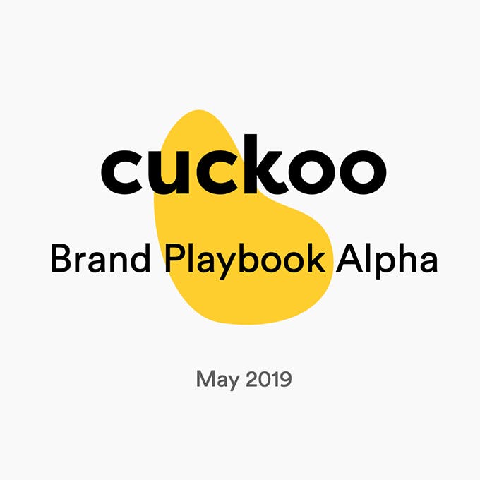
I still remember the cold November evening in 2018. Friends from a previous life, our CEO Alex and I were sat in a van eating cheeseburgers and he flirted the idea of a broadband company based on good morals. I turned to him and said ‘ the name Cuckoo’s got legs! ’. I spent 6 weekends and 15 late evenings cobbling together our original brand playbook; Cuckoo Alpha . We won over many people with that deck. Perception is everything.
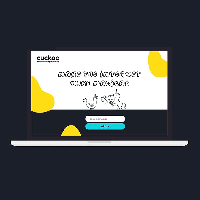
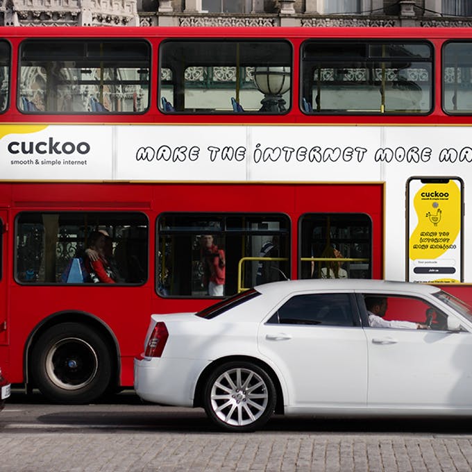
On 3 February 2020, Dan (our Head of Tech) and I quit our jobs and joined Alex full time. Today, just over 8 weeks later we are proud to reveal what’s been going on behind the scenes whilst we build Cuckoo; a broadband company that even your mum would be proud of.
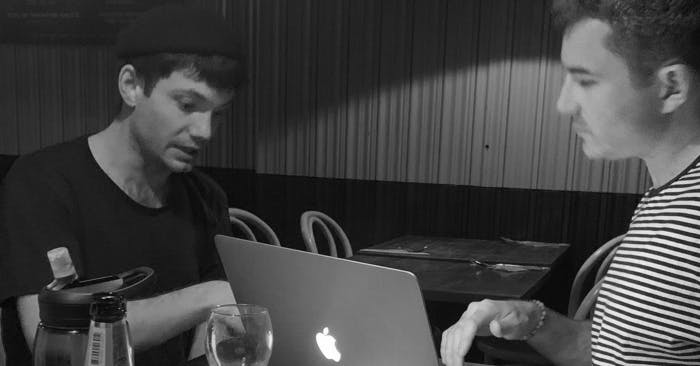

One of the perks of starting your own business is you can bring in the best people to help you and move very fast. As long as they share your “hell yeah!” attitude about good broadband to the masses. And that’s how we were lucky enough to bring on my school friend Ed Newton aka Sheddy ; the super talented designer of household favourites; House of Fraser and Sainsbury’s.

So we spent time trying to understand what was wrong, really wrong. In order to really immerse ourselves in what we were up against, we went radical with our research. Obviously we conducted the usual primary and secondary, quantitative and qualitative research. However, we also gatecrashed a competitor’s AGM. Emailed the executive leadership teams of the big guns. We even helped customers of our competitors with their connectivity problems. Is it weird to help your competitors' customers? Maybe. But that’s our style.

The telecoms landscape is full of industry jargon and confusing language. We are in a sector where every provider claims to have fast , super , unlimited, essential, ultrasuperfast , superultrafast, unlimited essential ultra superduper plus products which cause confusion, doubt, and mistrust. You still with me?
An ASA report from 2017 found fibre was one of the “many buzzwords to describe modern, fast broadband”
Our key takeaway? Be transparent and truthful.
An audience-led approach to design
From day one we’ve strived to incorporate customer insights into the decisions we make. We partnered with a polling company to get the opinions of over 4,000 people.
And we kept asking: What do you want from broadband? What do you think of your current provider? What makes you stick around? What makes you leave?
At the start of 2020, our waiting list rocketed to over 1,000 people. We’ve been using these wise folk to bounce ideas off, validate our assumptions and help shape our product strategy. We love getting emails from people around the country asking when can they switch, for good.
“We didn’t build the Mac for anyone else. We built it for ourselves”
- Steve Jobs
By listening to our customers, we realised that people often refer to broadband with words like “untrustworthy, rip-off, corporate.” That’s some pretty negative vocab to blanket an entire industry, right?
A radical one for the sector — contemporary, engaging, fun and audience-led. Cuckoo is an independent team, taking on the big guys and speaking to our customers in one voice across all platforms and channels.

The brief we set ourselves for the logo was that it had to be bold, iconic and contemporary. We wanted to create a brand that felt alive and echo’ed connectivity. A digital-first identity — one you’d expect from an internet company.
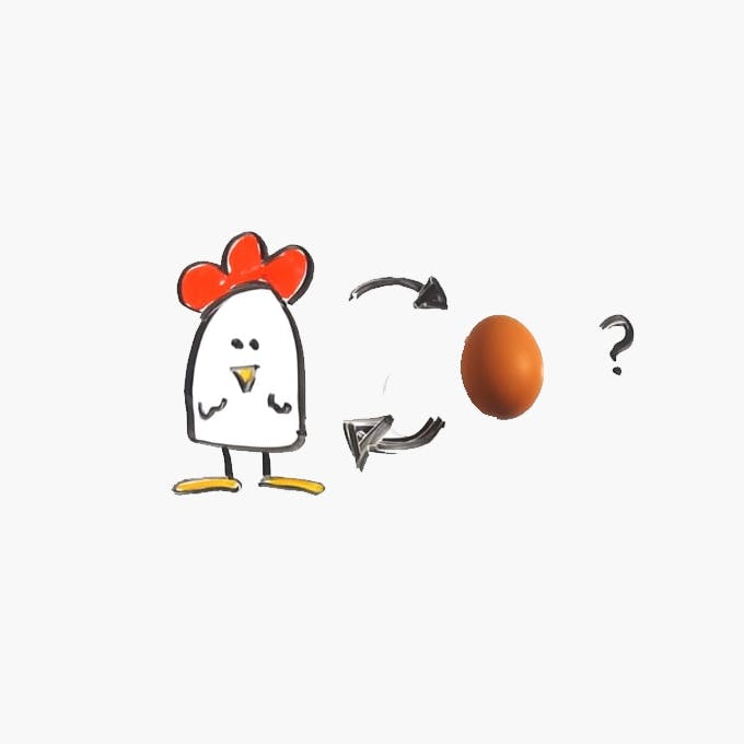
What came first the chicken or the egg?
The first concept was the obvious road of exploration; a bird metaphor. The problem is, the Cuckoo bird is a rather unfortunate looking bird. All of God’s creatures are beautiful, other than the Cuckoo bird it would seem. Challenge accepted we continued to explore a number of cliche bird metaphors. Over 131 different bird variations were discarded; to be exact.
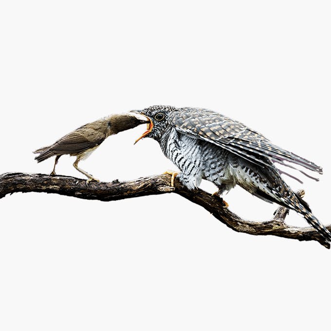
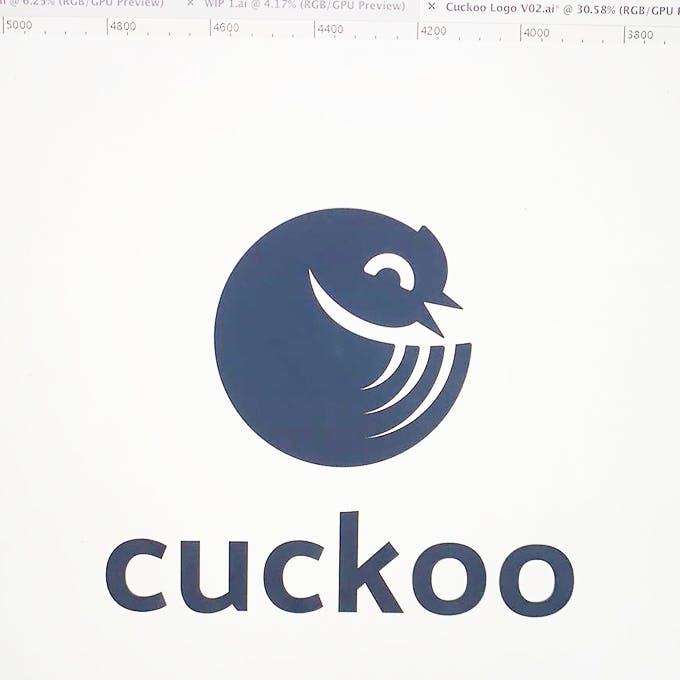
When designing a logo you often want to reduce the detail to the absolute minimum, whilst ensuring it’s still recognisable. We soon learned that to make a distinctly identifiable bird you need to show at least 3 of their 5 key characteristics; the beak, wings, tail, eyes, and body. Otherwise, you quickly end up with a seal, worm or bumblebee. It’s that or, it ends up like the Twitter logo. Every. Single. Time. We soon wrote off a bird and moved on.
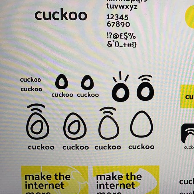
Enter the egg
Conceptually Ed and I knew we wanted to portray the feeling of connection . After all — the internet is at its core, all about connecting people. Every route we explored to date was either too complex in nature or just plainly didn’t feel right.
If an egg is broken by outside force, life ends. If broken by inside force, life begins. Great things always begin from inside.
- Anon
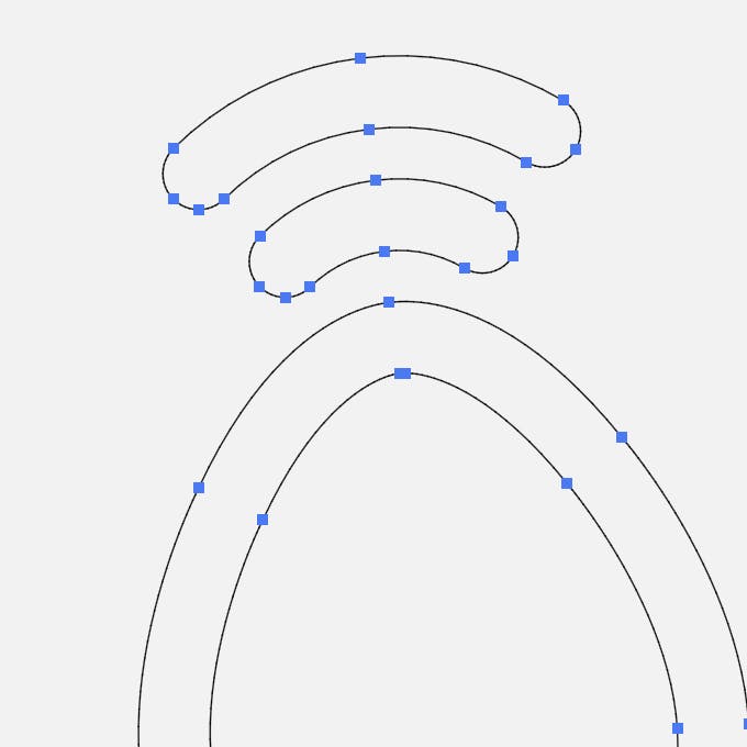
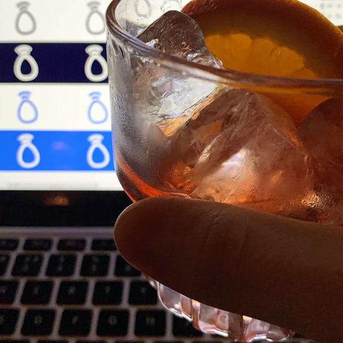
The second concept, we wanted to represent being connected by integrating pulse lines commonly associated with WiFi. We then combined it with something simple and pure; an egg . We diligently explored every type of egg style and shape (46 to be exact) until we settled on something simple and memorable. A brand mark that feels unique and ownable, having meaning at its core.
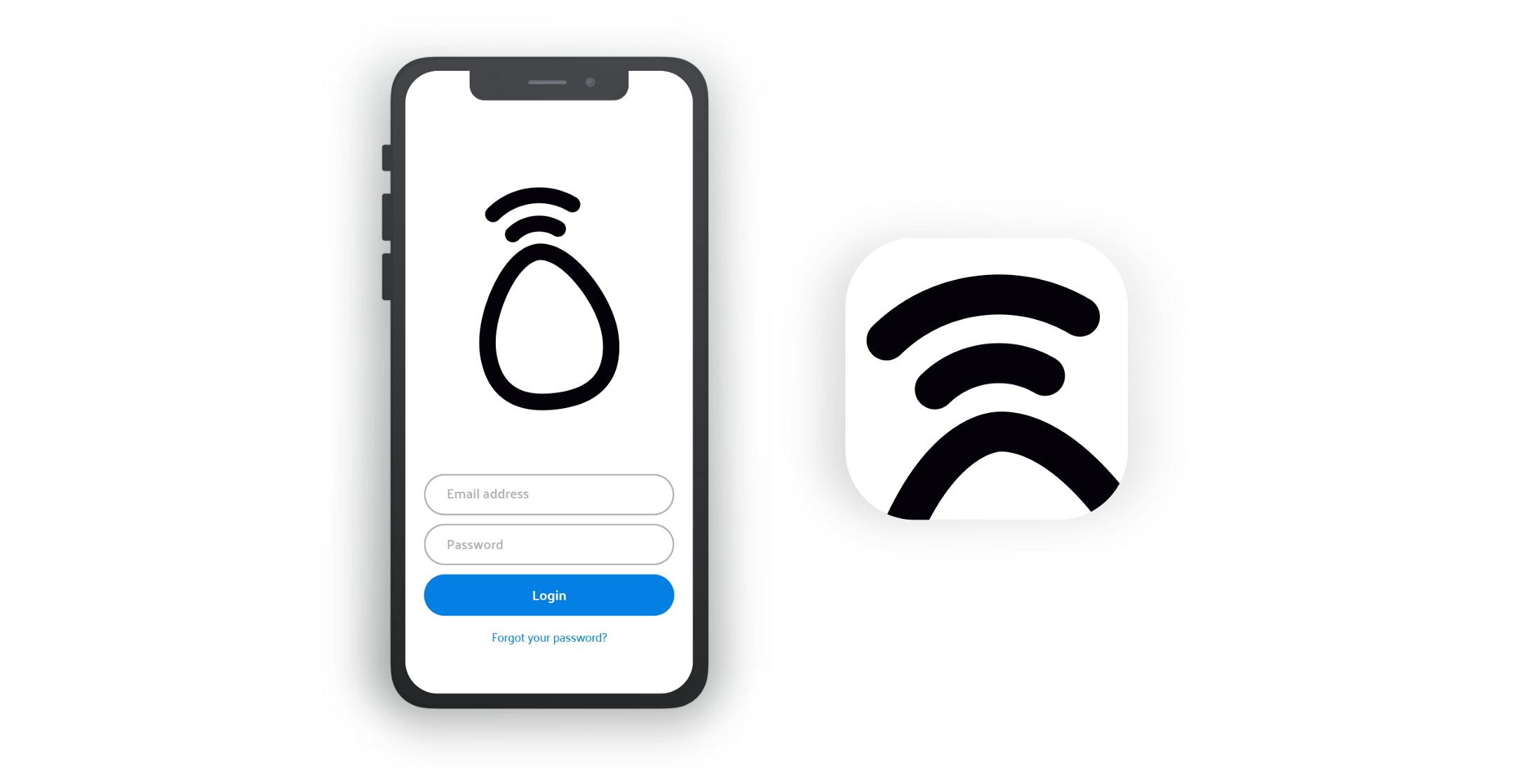
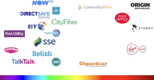
The telecoms industry is crowded with shades of utility purple, dashes of corporate blue and a sprinkle of blood red. In a saturated market (pun intended), the new kid on the block needs to stand out.
We’re competing with the big guys via pixels on your screen. We want those pixels to shine bright.
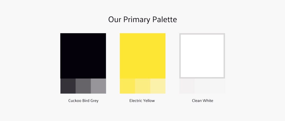
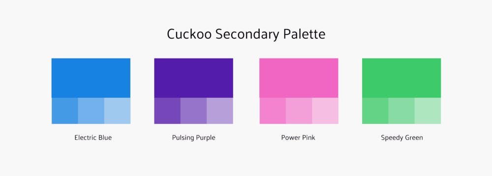
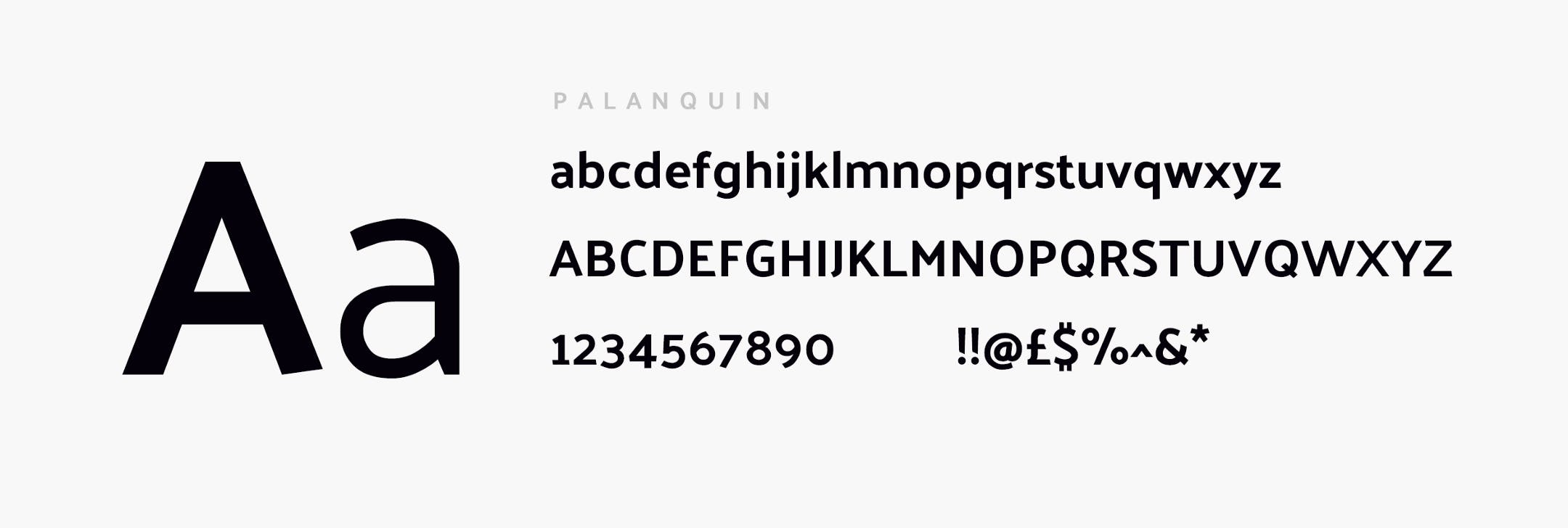
We have used Palanquin — a Google font developed by Pria Ravichandran, a type designer from India.
Palanquin is a Unicode-compliant Latin and Devanagari text type family designed for the digital age. The Devanagari is monolinear and was designed alongside the sans serif Latin.
The Palanquin font family is versatile and strikes a balance between typographic conventions and that bit of sparkle. Perfect for Cuckoo . The typeface renders beautifully at all sizes, especially on screen. As a brand, we want to ensure we’re taking responsible steps to reduce our carbon footprint so it is less important how it prints; we won’t be big paper wasters. Paperless billing will mean that almost all of our customer's interaction with us will be online. A font designed for the screen was a natural choice.

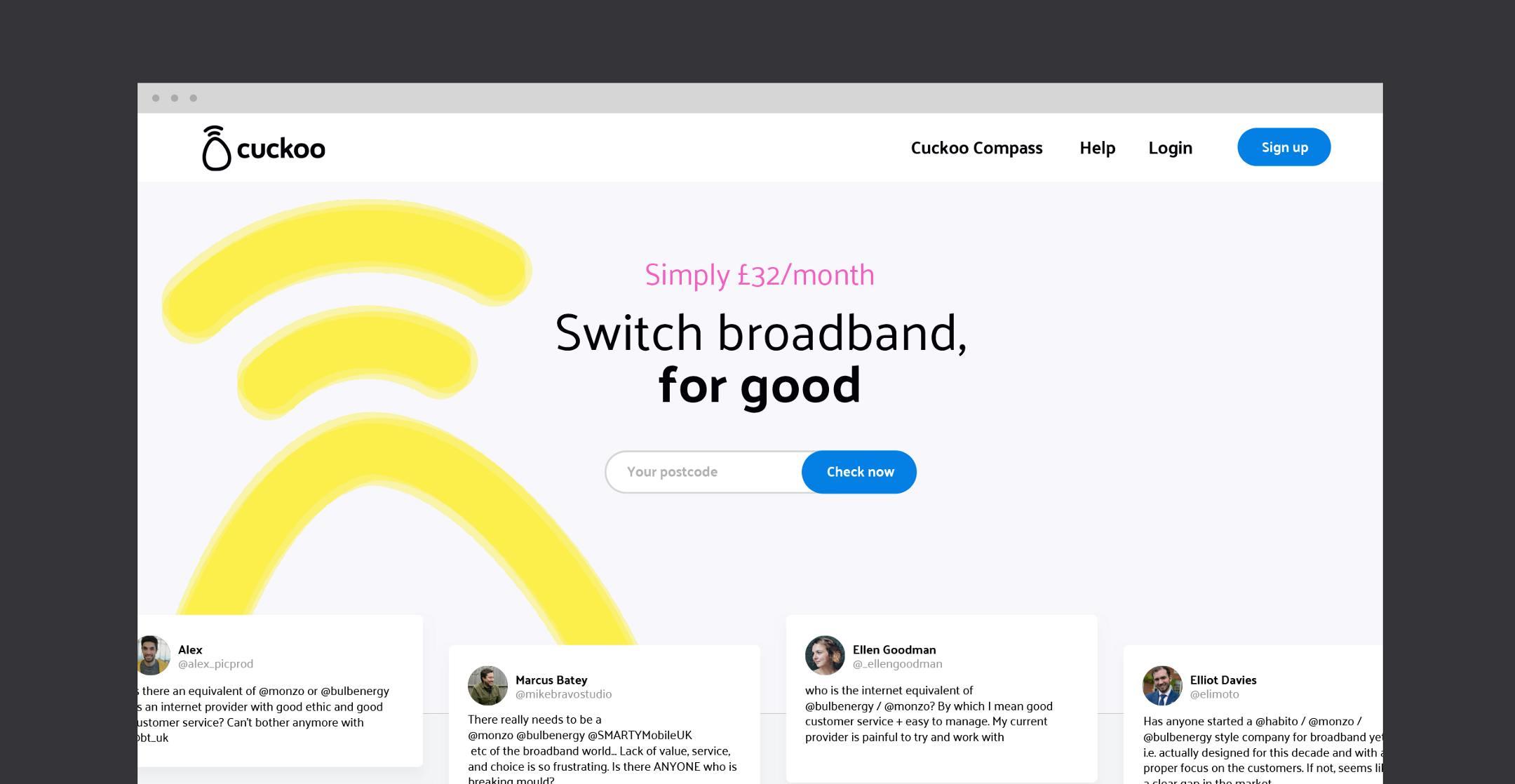
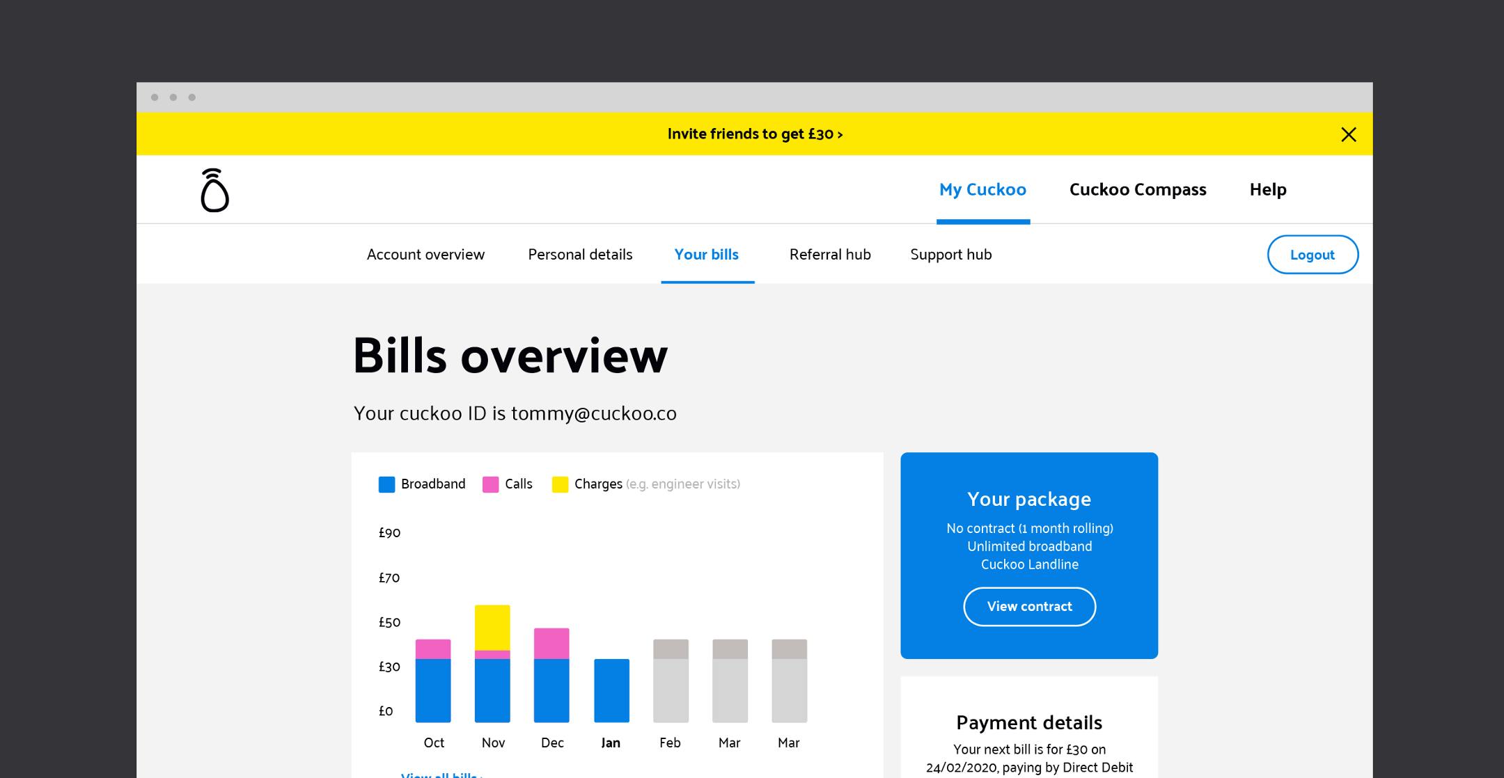
What are the words that you associate with talking to your broadband company? Corporate , untrustworthy , stale, boredom, waiting are just some of the words we heard when we spoke to people about the broadband industry. So much of our business is founded on how our customers feel about being on our network.
This is how we talk. This is how our Eggcellent Experts will sound whether you are chatting to us on WhatsApp, text, email or over the phone. And we promise not to actually say that.


We’re making broadband simple, for good.
Behold the launch of our new brand and design system (Yolk). It’s bold, brave and kind of beautiful (sure, we are bias). We feel this is a big step in continuing to deliver the Cuckoo mission - to be the UK's largest and most loved broadband company.