- ArticlesTeam
Dev Diaries: Georgia
Meet Georgia - she has been working in tech for over 6 years and has been part of the flock here at Cuckoo since June 2022.
At Cuckoo, we believe that designing for the web — the medium for which the majority of our product and communications exist — it’s our responsibility to think foremost about how our choices impact the person or environment on the other end of the conversation.
Even the tiniest and seemingly insignificant design decision can have far-reaching consequences, and good ethics can help us create pathways to better futures for all who use our services.
A question that I’ve come across is ‘what is the difference between good design and ethical design?’
Dan Guy, head of the Ethics Committee at the Office of the Public Guardian defines the two practices as:
‘Good design’ gets its criteria from how reliably, consistently and well a problem is solved. So what about ethical design? What more can be done to ensure a positive human experience?
‘Ethical design’ gets its criteria from how it impacts individuals, society as a whole and the planet. If it impacts them for the better, then the design is ethical. If for the worse, then it is simply unethical.
As above, ethical design considers what it wants to avoid, along with what it wants to promote. It keeps an eye on its wider context in the world and how it affects people, society and the planet. It needs to be mindful of long-term as well as short-term effects. It also needs to be concerned with making things better in some sense — not just in terms of the problem it’s solving, but in terms of making the world a happier, healthier, fairer, more honest and peaceful place.
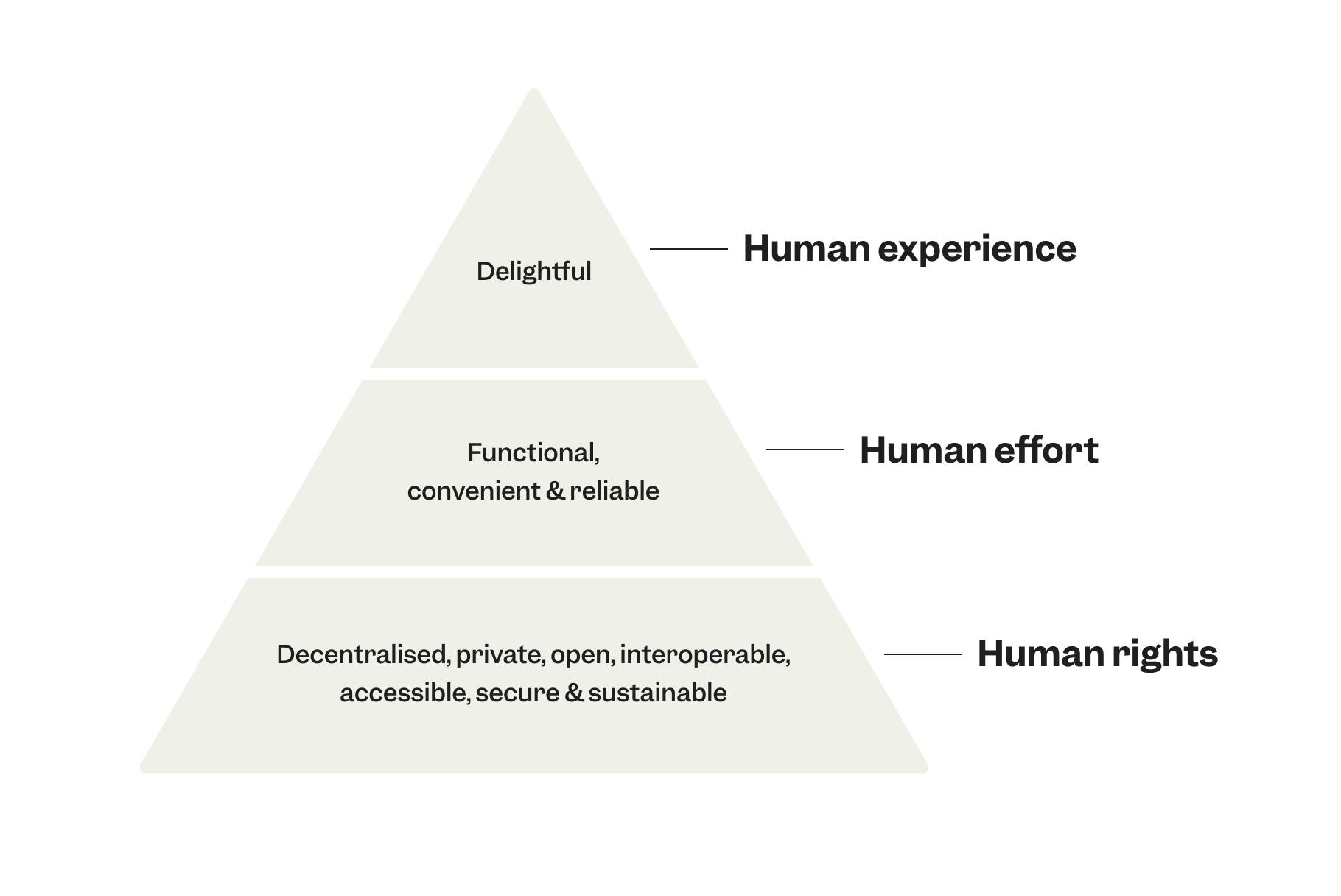
Below is a graphic taken from the Ethical Design Manifesto, basing design around the basic needs to respect human rights, effort and experience.
In recent times, ethics (as well as sustainability) have been in danger of becoming a buzzword or green-washed within the tech industry. Bad design decisions can lead to devastating personal, organisational and societal consequences, so ethics have to be handled with care and a deep sense of conviction. I believe now more than ever that ethics are paramount to digital experience design. How do we define and measure goodness and rightness in the increasingly used digital realm?
Below, I’ve tried to present a few key principles that we at Cuckoo hope to take forward to ensure we design within an ethical framework.
Dark patterns on the web work well. Definitely too well. And for now, there’s not much you or I can do about it.
I often refer to a common example for this. Assuming you have created an Amazon prime account, have you ever tried to delete it? If so, you’d quickly realise that it’s a borderline impossible task. Amazon makes it oh so easy for you to create an account, but forces you to search its labyrinth — the deepest, darkest corners of the website — to close it. And even then, it take’s around 4 or 5 clicks to confirm the confirmation of confirming you want to leave.
This of course is no accident on their part. It’s actually a persuasive web design tactic often referred to as the “roach motel” — “A wide-ranging group of ‘dark ux patterns’ that describe user experience techniques in which users can easily get into a certain situation but then, intentionally, have a hard time getting out of the given situation once they realise it is undesirable.”
Sadly Amazon isn’t alone in using ‘clever’ design to manipulate users’ behaviour. I strongly believe that design should be a guide for the user, and not a strict path. The user’s needs should be the overriding factor in an experience design, and therefore a journey-map should never be purely for financial gain, social following or other self-serving factors.
In stark contrast to the Amazon example, Cuckoo’s cancellation is designed to be intuitive and extremely findable. For example, our account section has a leave flow for any customer on our rolling contract to leave as and when they decide. We really do believe here that leaving Cuckoo should be as simple as it is to join. No guilt, no manipulation - but a friendly goodbye.
The key goal for our website (and arguably most websites) is to convey our service as simply and as effectively as possible. Therefore, the clarity of our message and storytelling needs to be the most important aspect of it. We want to help users focus on relevant information instead of distracting them.
Some of the most common examples of ignorant or malicious attempts to shift a users flow include:
Cuckoo’s architecture and messaging has been intentionally scrutinised with our customer’s interests defined as the primary focus. We test any new initiatives with real humans so that we can gain multiple perspectives - and in-turn, design with a more rounded viewpoint.
Too many fonts on one single item (in this case, a website) decreases cognitive fluency. This means users will find it difficult to understand what they’re looking at. Script fonts are hard to read, decreasing ease of use for visitors and potentially pushing them away.
For this reason, we’ve chosen to use only one typeface, Garnett, a font with wide characters, designed specifically to be easy to read and digest - and designed to be filled with character and warmth with over-pronounced arches and small underbites on the terminals. We use Garnett with two weights (Semibold and Regular) for our new brand. Additionally, the fewer font files used, the lighter and faster website pages will be - resulting in an even greater user experience.

Websites should be easy to navigate - and even, dare I say it, a delight to navigate. A common example of bad navigation includes multi-stepped menus: options can quickly become overwhelming, making users frustrated and motivating them to go elsewhere. We introduced a simple form of baseline navigation on our mobile join flow as we were noticing our customers were finding it confusing to move forward within the steps of signing-up. Websites should be straightforward, familiar and consistent to navigate on all device sizes.
What are the consequences of our design decisions? Do they improve the common good of those using it? If not, we should consider our design approach and the role our website plays within society.
“Ethics for designers means trying your best to make sure the work you do respects the user.”
- — Alex Li
Ethics in design is more of an evaluation tool that helps define an alignment with human respect. I understand it’s a very hard balancing act, especially for the e-commerce space where conversion-rates and profit are a priority; but speaking purely, design ethics are an obligation for designers to prioritise the value of the rights of the end-user while respecting the product at the same time.
Cuckoo’s UXD (User Experience Design) team gathers bi-annually to workshop how our website can become increasingly accessible and universal. We’re by no-means experts in this realm, but we’re getting there.
Cuckoo is broadband that starts good, stays good and does good.

Meet Georgia - she has been working in tech for over 6 years and has been part of the flock here at Cuckoo since June 2022.

Imagine bringing together over 300 people from different companies, cultures, backgrounds and experiences into one new company. How do you get those people to feel like one? Well, you ask them one simple question: What values do you want to have to make you feel like you belong at Cuckoo? .